
Anchor Plastics, INC - Internship
A small plastic manufacturing business that I work as a Graphic Design Internship located in Golden Valley, MN. Redesign the old anchor logo to a more modern sharp design to help maintain relevance in the market, enhance recognition, and competitive edge to it’s competitors. Was task to redesign the logo and update their website/booklet/business card/training videos.
Anchor Plastics, INC Redesign Logo
Most projects in my portfolio are self-made but this entry is a real world experience case study, showing my process at my internship during this summer 2024.
The client, Anchor Plastics, INC, is a plastic manufacturing business that produces high-quality plastic and services located in Golden Valley, MN. They shared with me their how their operations perform and in need of a redesign due to lack of sales.
I kicked off the project by asking what the owner questions about his company and what they look forward for. It’s my efficient way to understand the brand. It helps the client and myself the aspects of their business that they maybe haven’t articulated before.
Learning what they do, their message, and purpose is what gets me excited about parts of a project. The owner and staff did a great job answering and was very clear and consistent.
Then I summarized the key ideas, made up a list of questions, and searched the internet for logo ideas to discuss together. I picked samples based on content and style, showing general approaches that could work with this project. I included some examples that might not be the right direction to give some confirmation with the client. It’s better to know what not to do.
We had a group meeting to get aligned: we needed to redesign the old logo that was outdated, but keep it relatively the same, more sleeker and sharper. Manufacturing style but not overly exaggerated. More cold not warm. With a symbol that could be used separately from the wordmark.
I then went to work.
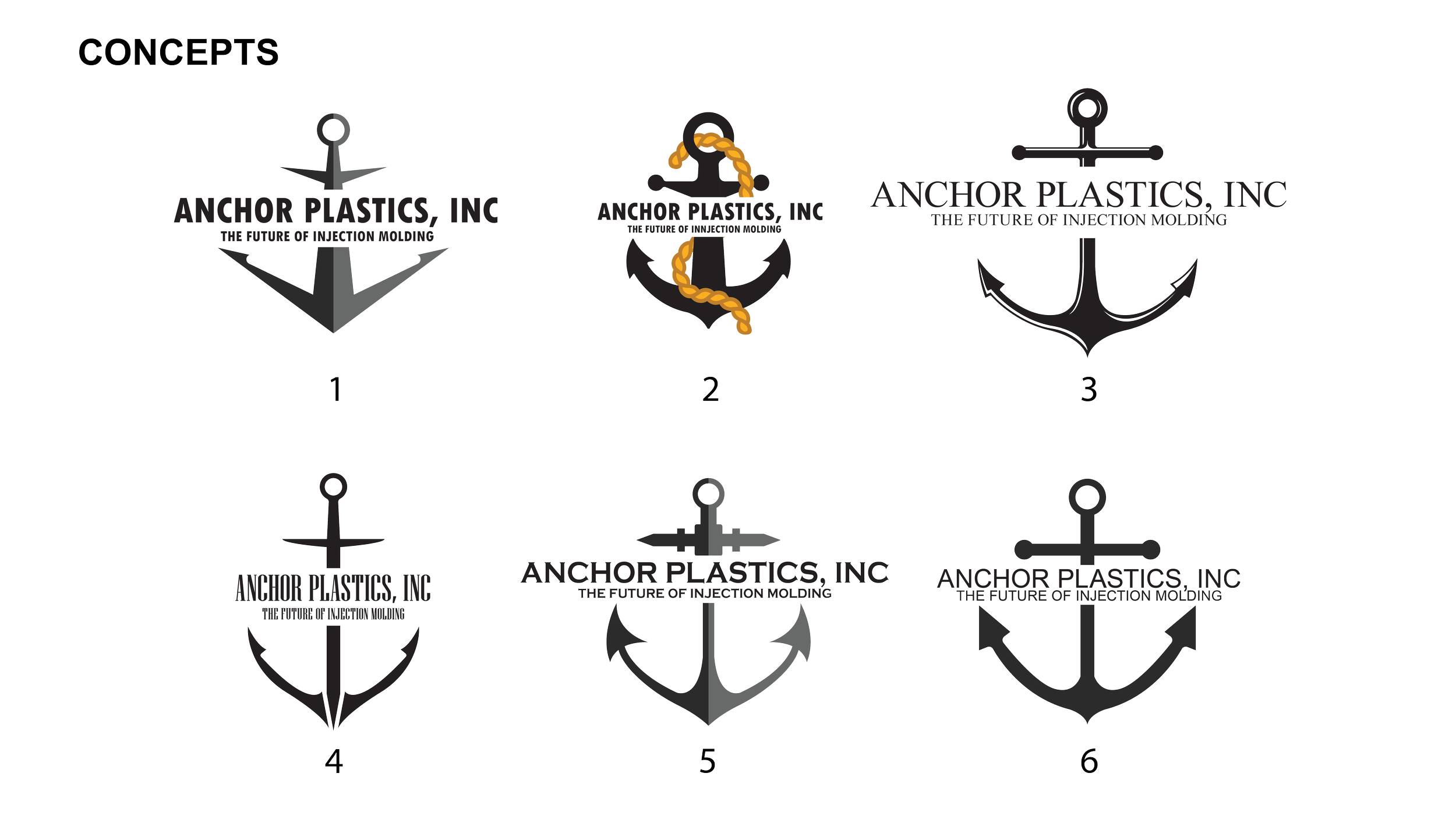
These were my initial redesign ideas for Anchor Plastics, INC. There is an anchor that is sharp with straight edges to showcase the previous ideas. I also thought about having one anchor with a sword or curvy hook style. Or what one that isn’t sleek and more thicker than the rest. Or one with highlights to show the 3D aspect of an anchor?
We also included several fonts choices to see what fits the anchor the best. We decided to go with #3:Times New Roman because of serif font style and graceful appearance.
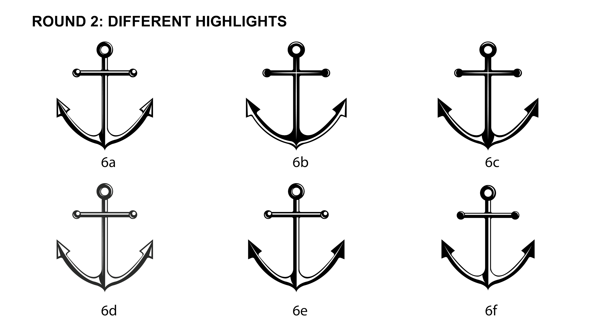
We decided to choose concept 6 that is not overly sharp but retains the classical anchor looks. We added highlights from 3 into the classical version to experiment how it would look. Creating 6 version to highlight different angles of light. We decided to test with 6d and see how it would look on some mock-ups.
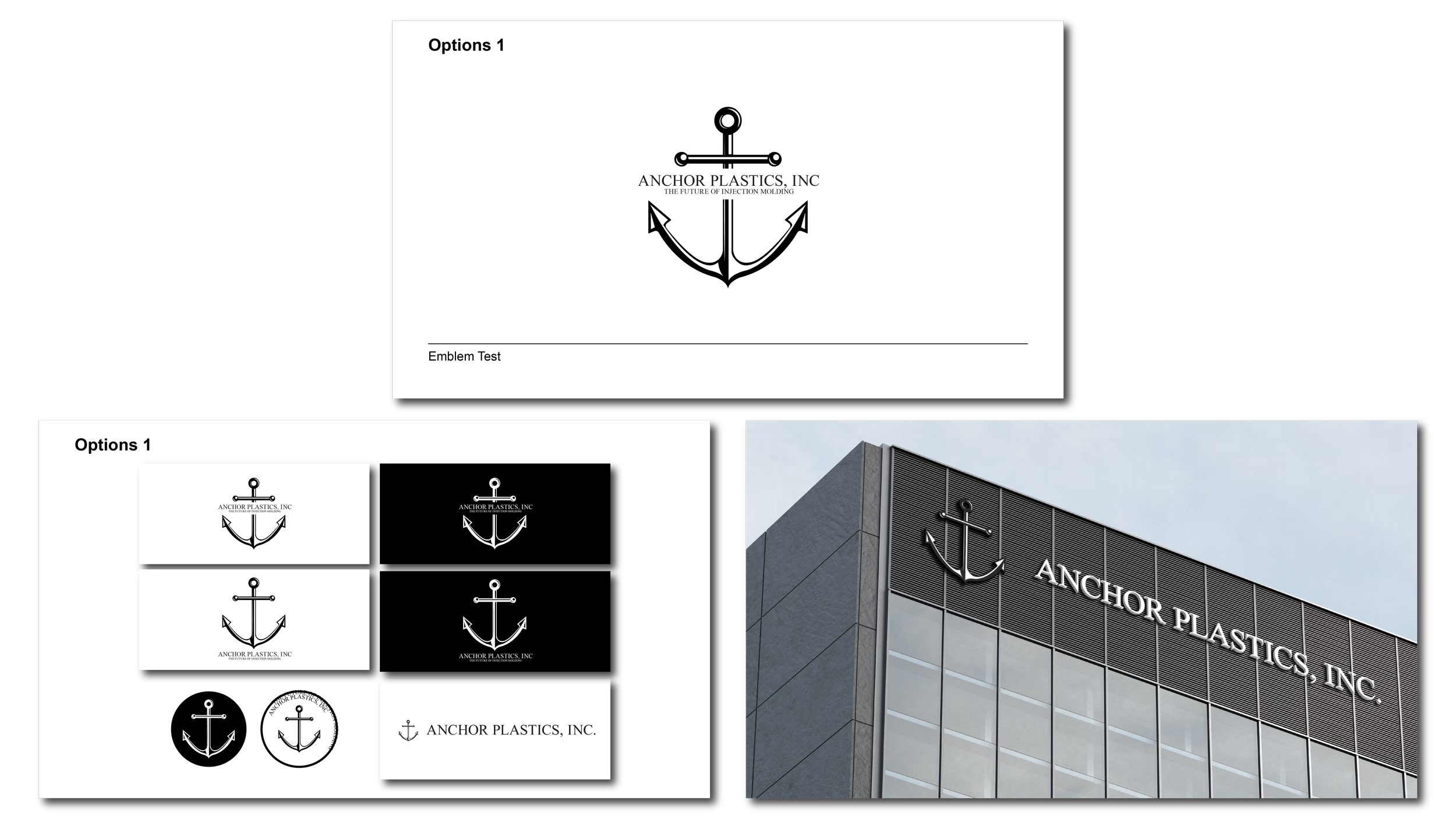
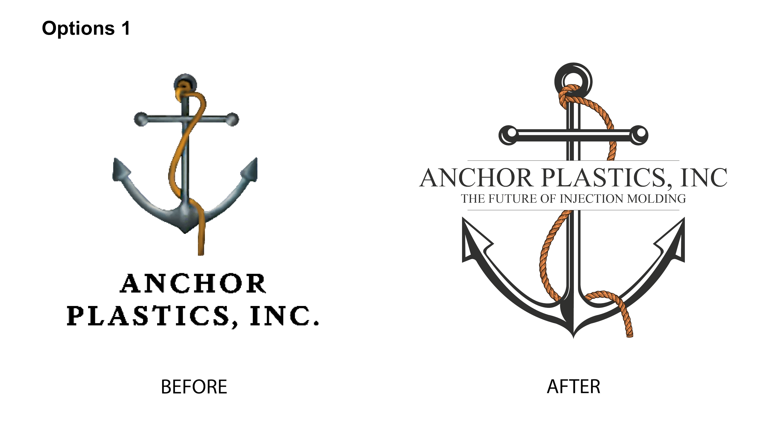
For each mock-ups, I showed the main logo, reversed color options, vertical and horizontal lockups, and a social profile image. When testing out the concept, we felt it was lacking another element to enhance the logo. We decided to add the rope wrapping around the anchor to see it would improve the style and spacing.
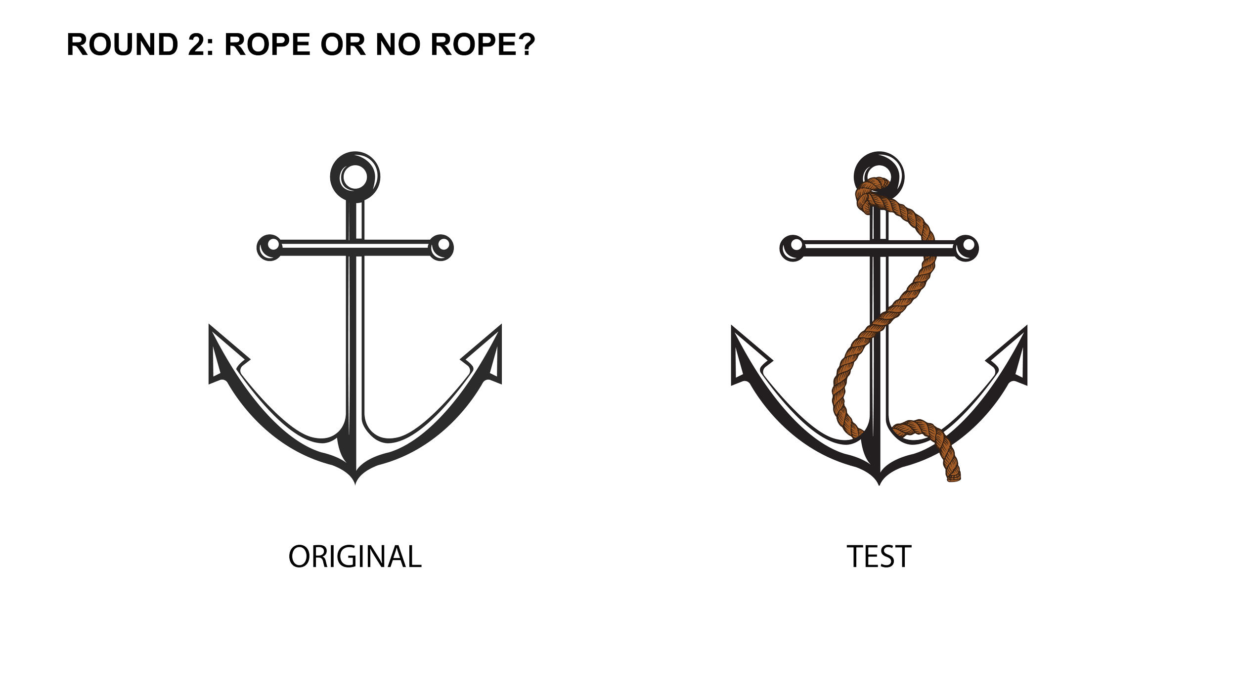
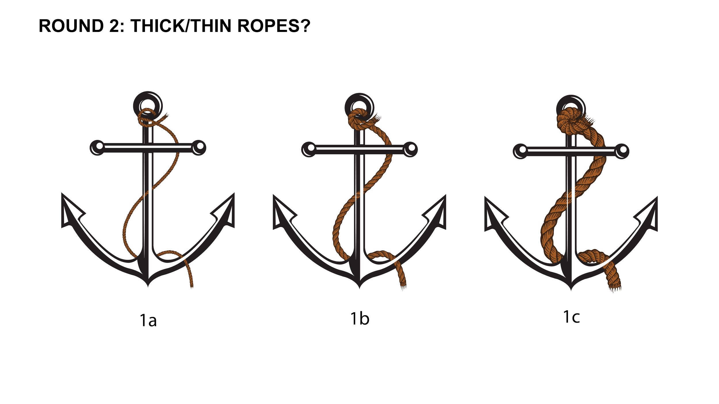
After adding the rope, we agree that it should be included with the anchor. There was a few edits the team wanted to see, just to make sure we had the best version of this idea. Perhaps different thickness of the rope? We eventually decided that the perfect thickness would be between 1a and 1b. We also change the rope color to be more brighter than the dark brown to highlight it more.
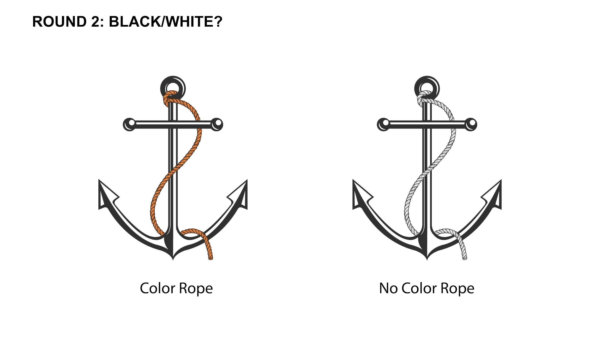
We wanted to see how it would look when there’s no colors as the client wanted it to be versatile: on t-shirts, mugs, or other applications.
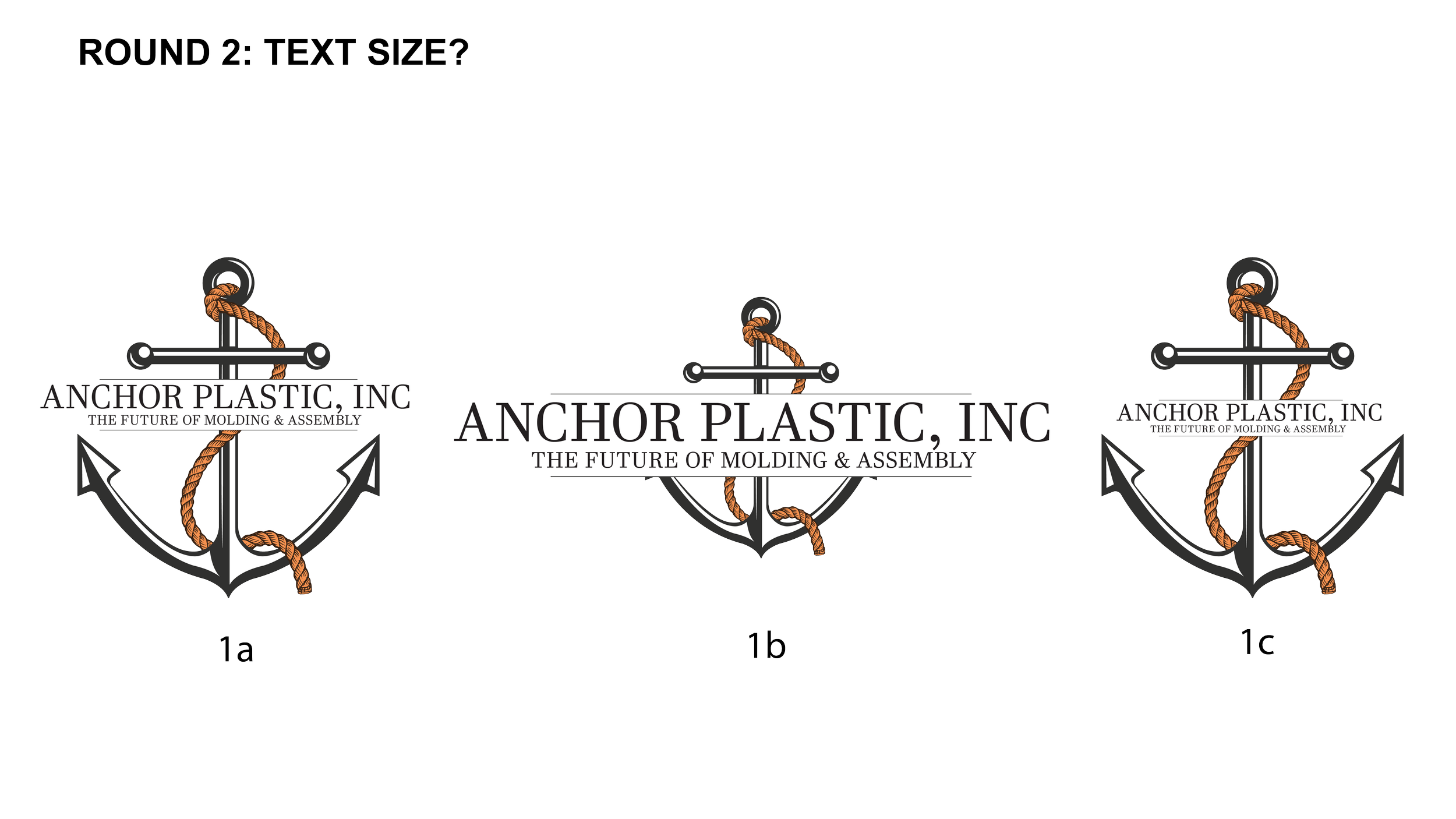
With the new anchor, we added the companies name and their slogan in the middle with different sizing to test which fits the best (font: Times New Roman). The edits did not come out as we expected because the sizing of the anchor was too short. We decided to enlarge the anchor to help the text placement and use 1a as it showcase the entire anchor than the rest.
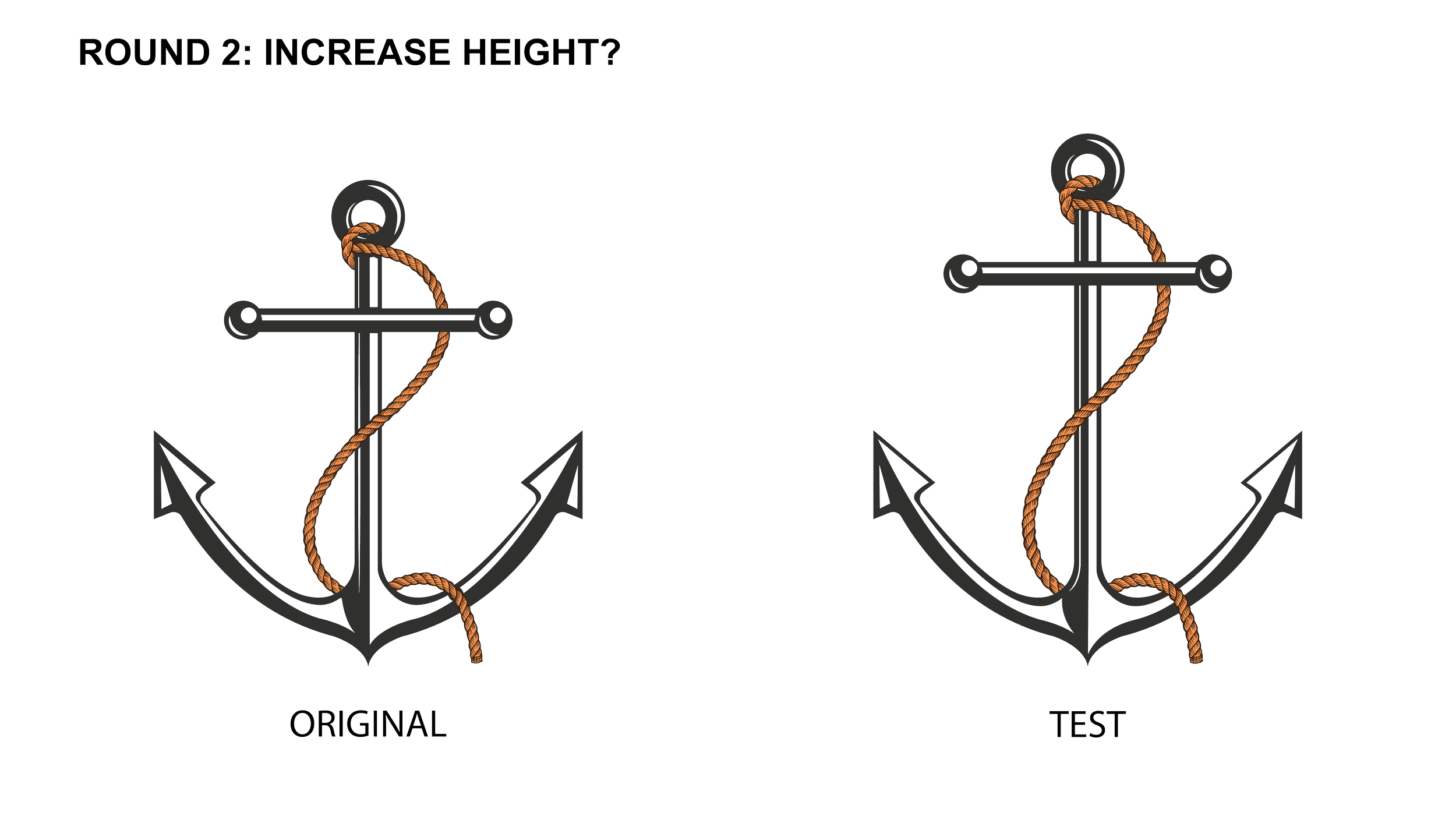
We enlarge it by 1/4 to see if the edit would look better along with the rope.
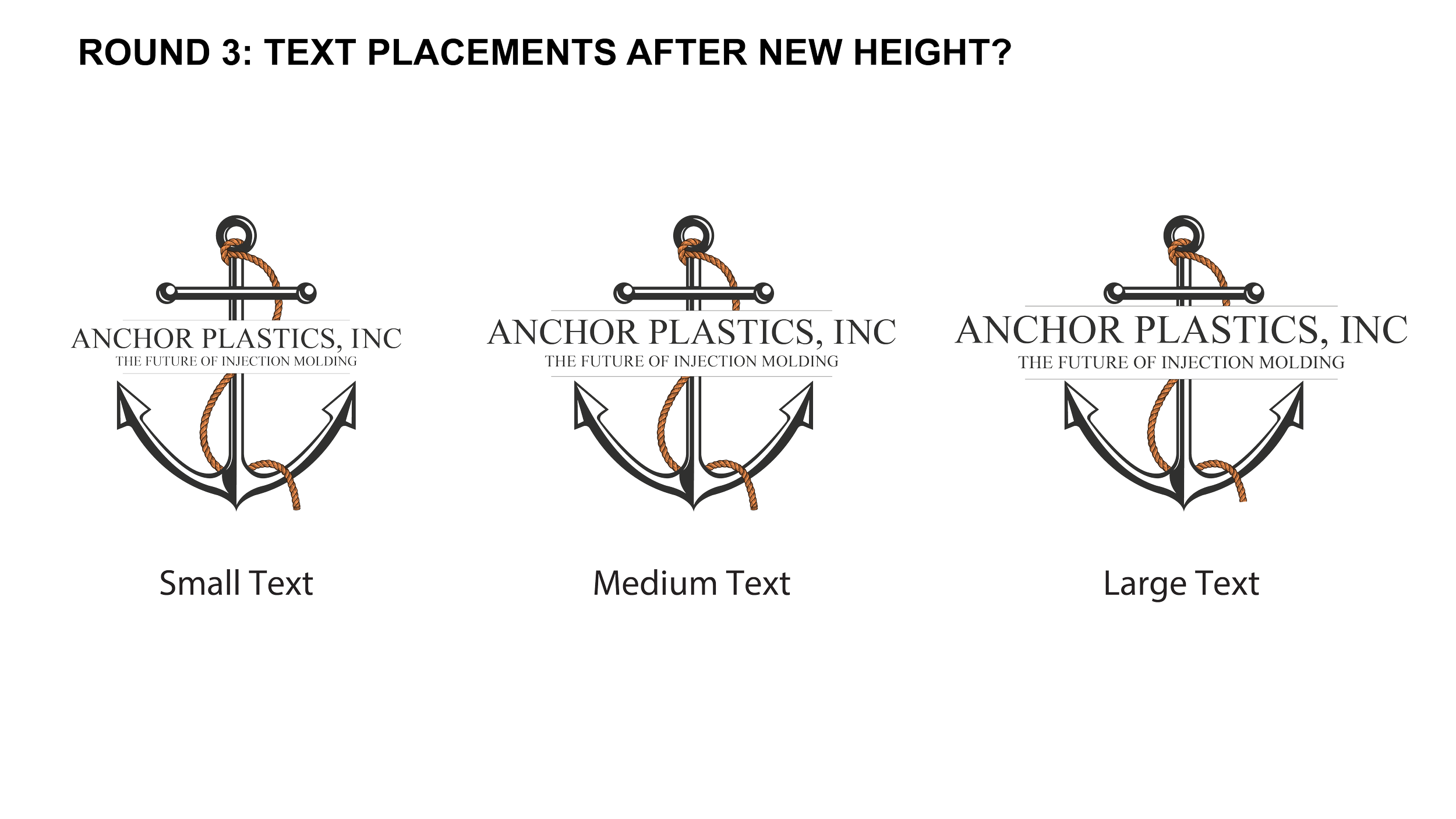
Following concept 1a, we played around the size of the text/placement. We went with small text version because of readability and compact size.
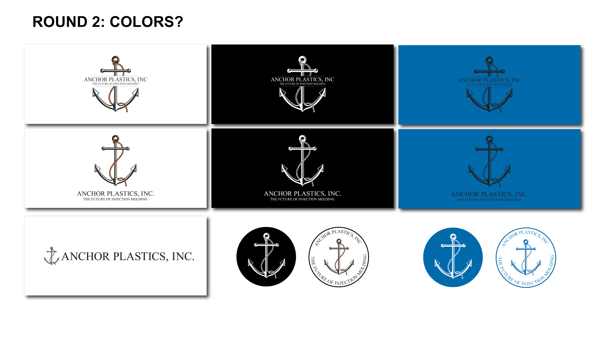
Playing around what the redesign could look like in a vertical and horizontal lockup, emblem, and color variations.
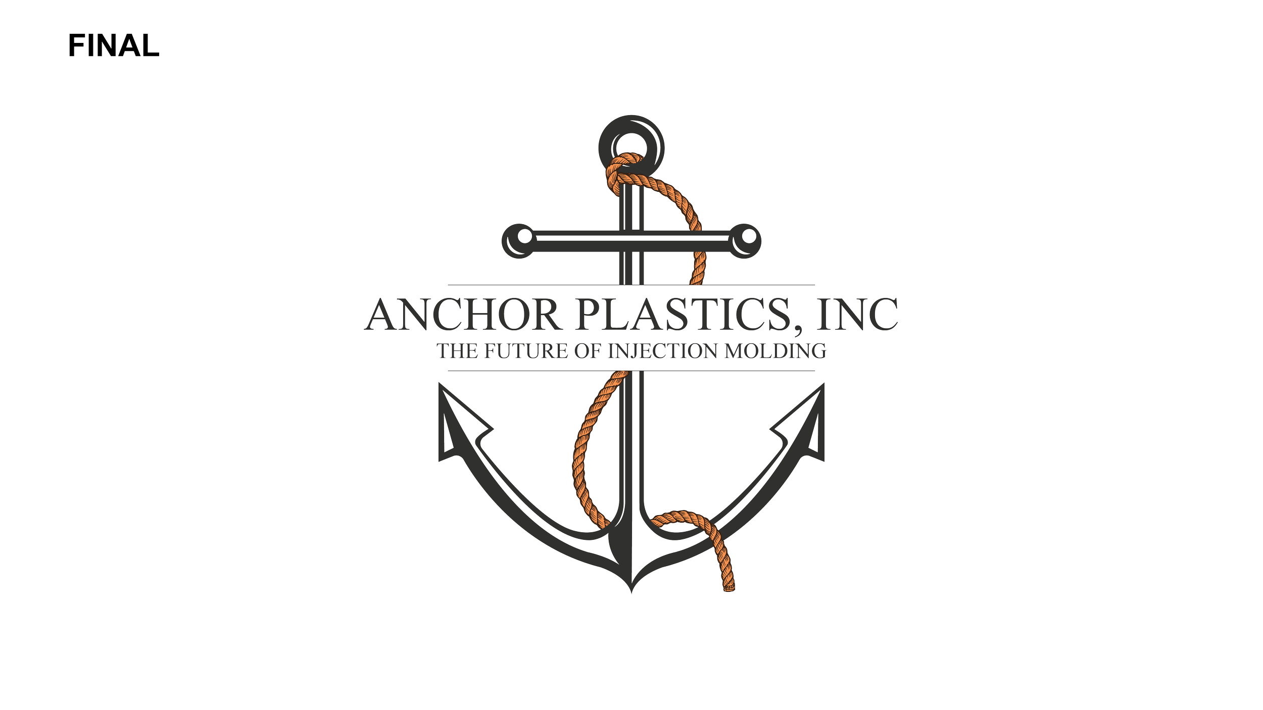
In the end, we kept most aspects the same as the original. We like the sharper and sleeker design type, since it felt precise and more bold. But we like the simple highlights along with the detail rope design.
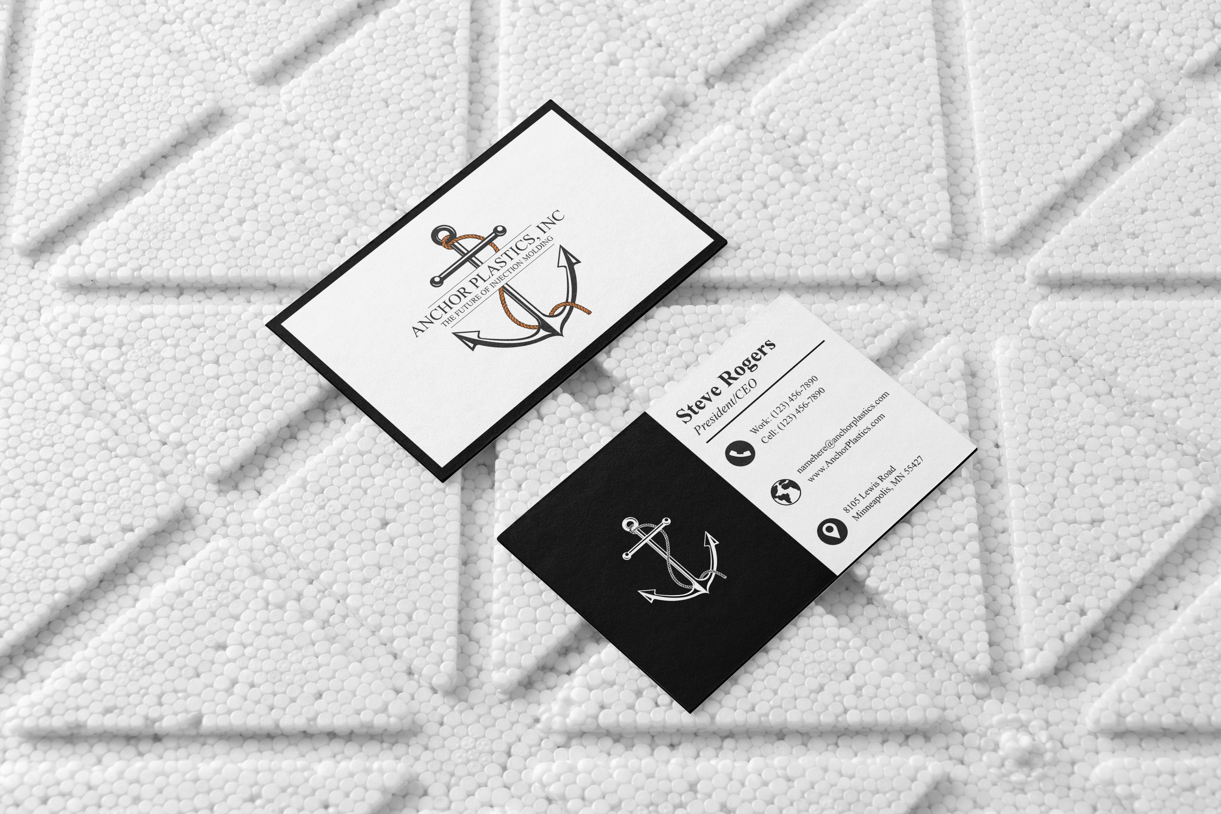
I added lines to separate the companies name to help space the text from the anchor symbol. I included the slogan as a way to show Anchor Plastics mission.
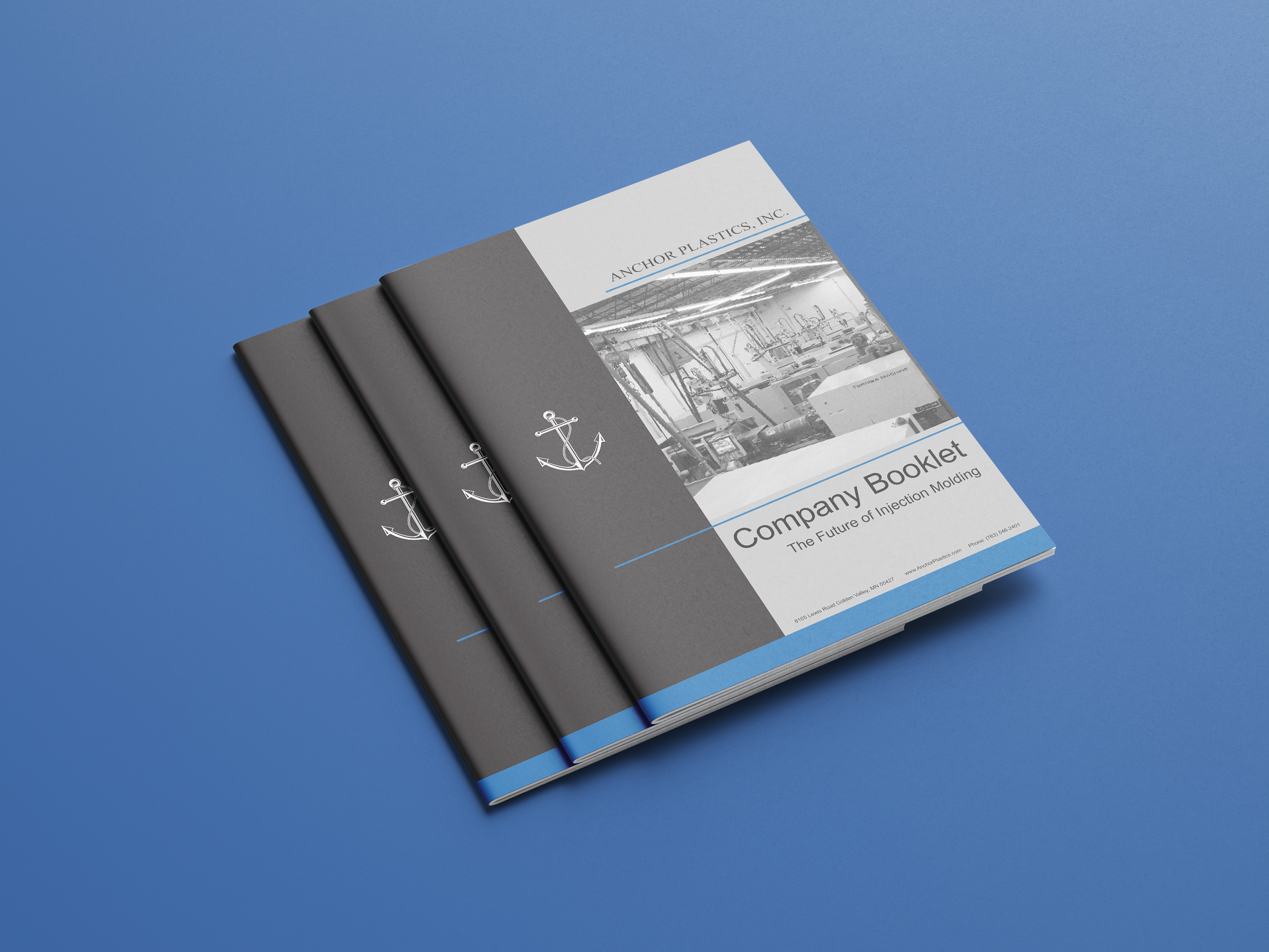
It wasn’t part of the project scope, but I couldn’t help recreating the website to fit along with the redesign. It was important to improve the website to help show who/what Anchor Plastics, Inc. does.
It was a pleasure working with the Anchor Plastics team, and we’re excited to see this redesign come to life.
Sales Video Presentation
One of the videos we created to help improve the sales department with the new redesign logo to maintain relevance in the market and its customers. It greatly help customers on subjects that Anchor Plastics specialize in.